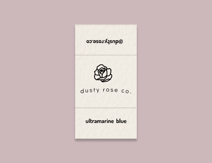
Dusty Rose Co. started as a passion project between me and a friend in my tiny studio. As someone who painted with watercolors on a semi-regular basis, I was frustrated by the subpar watercolor options on the market. Most commercial watercolors are made with synthetic pigment that fades quickly. After talking to some other artists, I knew that this wasn't just a problem I was experiencing.
Project Details
Team: Me (Branding), Isabel B. (Marketing)
Problem
Artists value the art of the craft and knowing the person behind the craft. However most watercolor paints on the market are commercially made using cheap synthetic pigment with no face to their brand.
How do we let artists know that hand crafted watercolors are what they've been for while showing up with a distinct yet cohesive brand vision?
Opportunity
As we break into the artist industy, it is crucial to develop a creative strategy that takes the needs of our audience into consideration. This strategy will help us tell a cohesive story, so artists can recognize our brand— thus setting us apart from our competitors.
Goal
Create consistency amongst shared visual language. Concistency is key and will help tell us tell a cohesive story which artists can identify and recognize.
Research
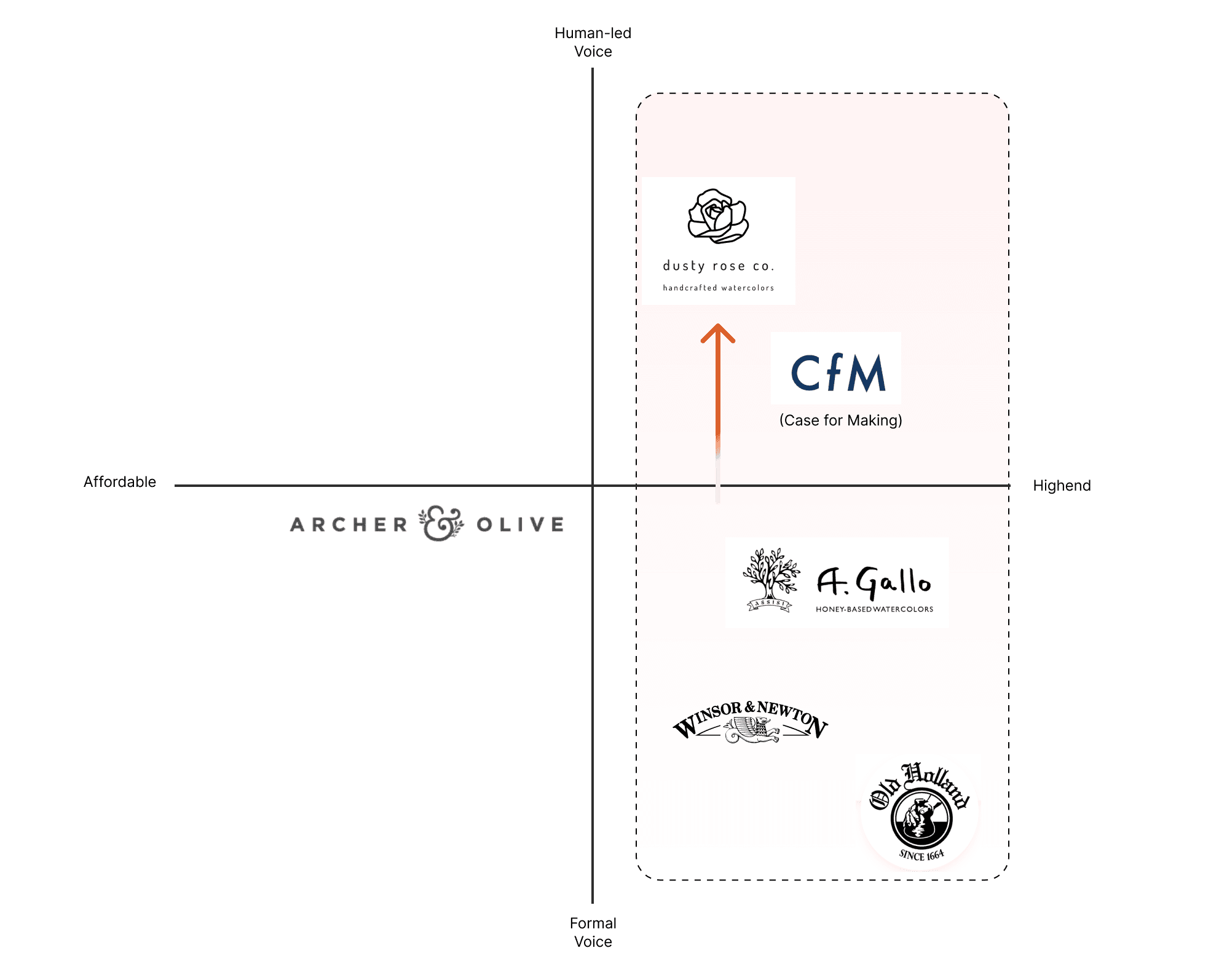
I conducted a competitive analysis which can help us get a better picture of the competition. This will help us identify what makes them successful, but also recognize where we can stand out.
Methodology
Competitive Landscape
A survey of other competitors and prominent artist paint making instititutions shows a clear opportunity for Dusty Rose. We have a chance to connect more directly on a human level while offering archival watercolor paints at a more affordable price point.
Designing a fitting personality
Logotype
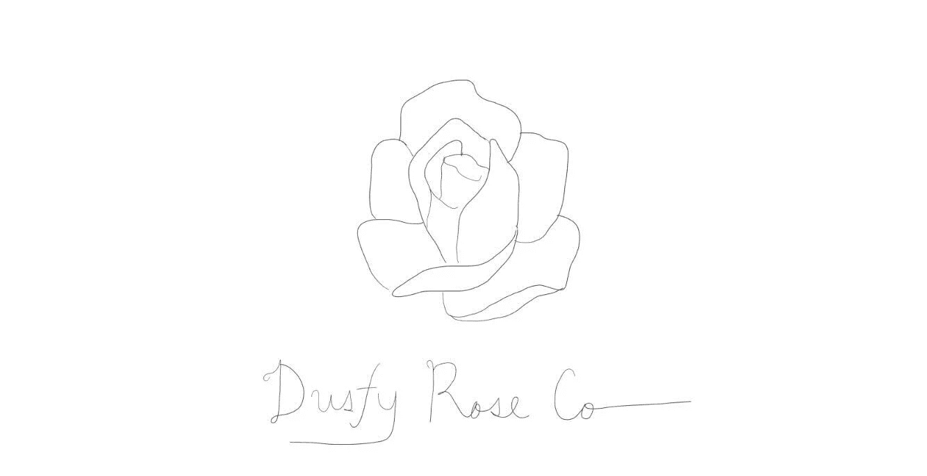
The dusty rose logo is a single simple rose. Using curved shapes and simple lines — the rose is a symbol of what we stand for — simplicity, quality, and luxury.
T
Typography
We picked a modern san serif to reflect the simple but luxurious feeling of Dusty Rose Co.
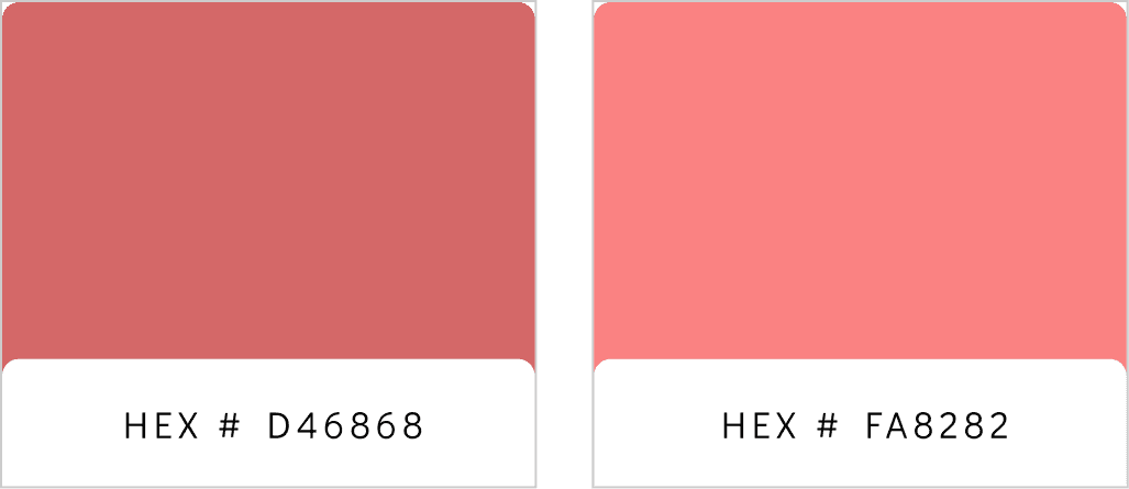
Color Palette
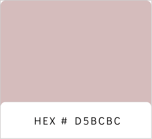
Secondary Colors
Gray Scale
Deliverables
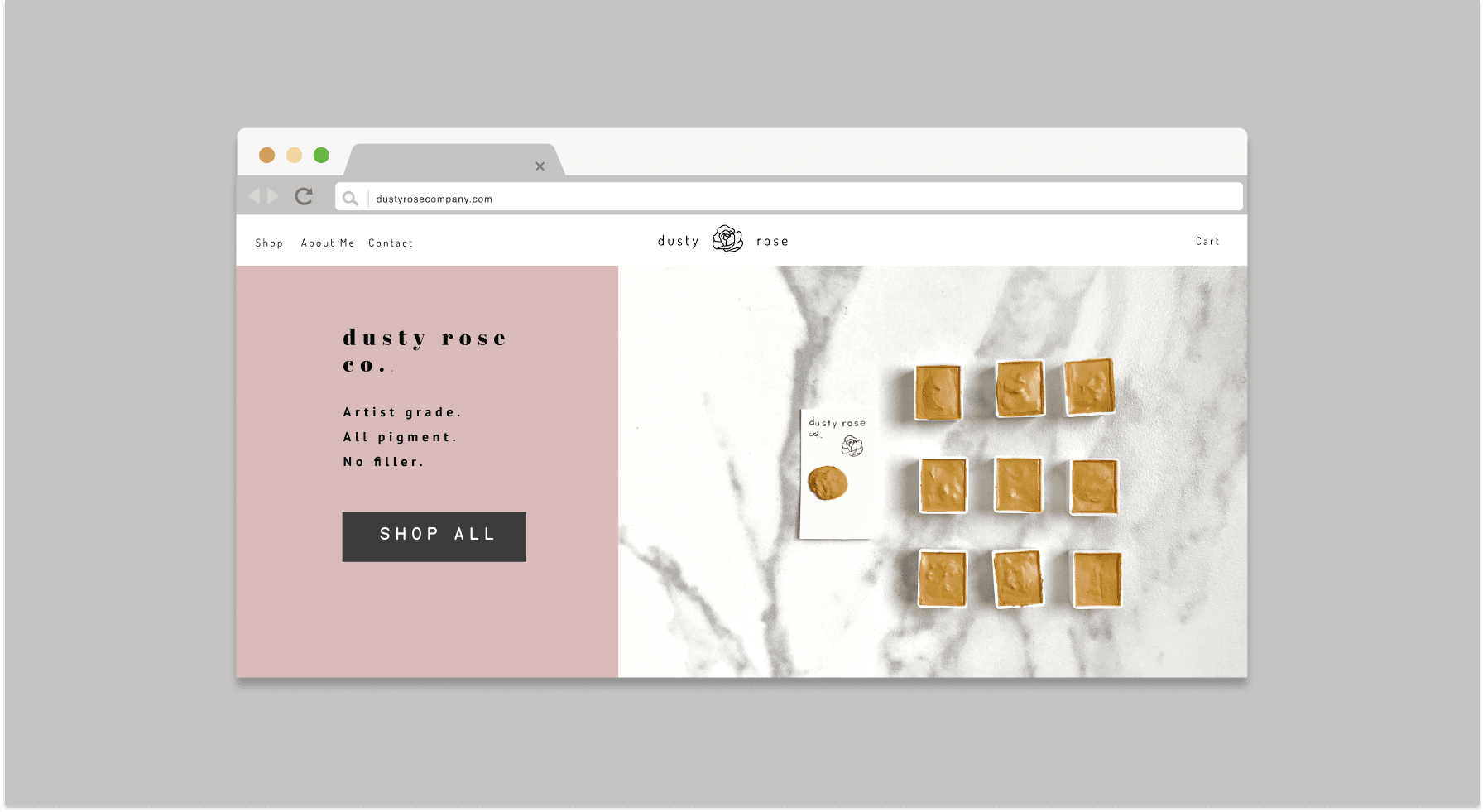
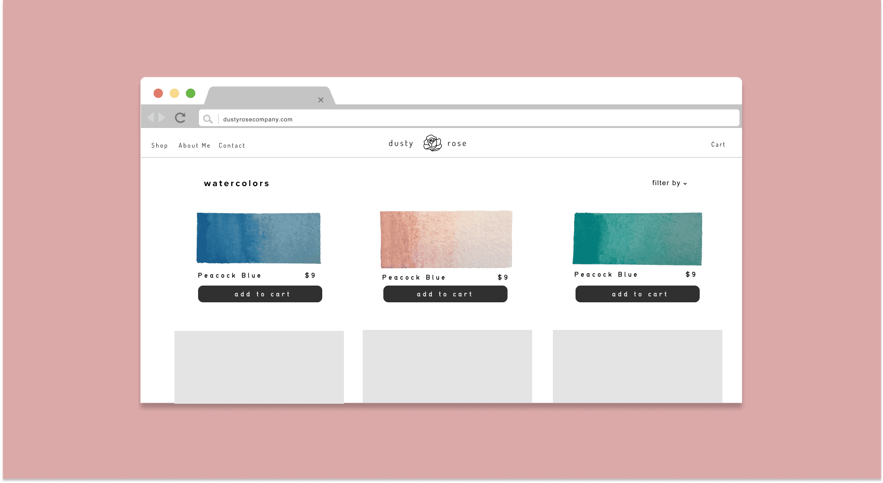
Website and Landing Page
Playful and whimiscal
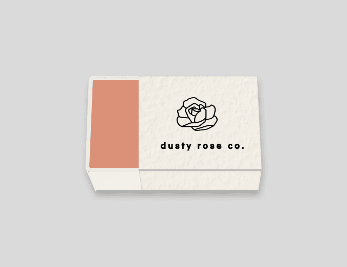
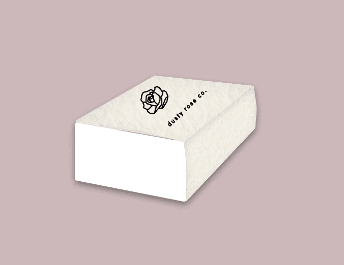
Packaging
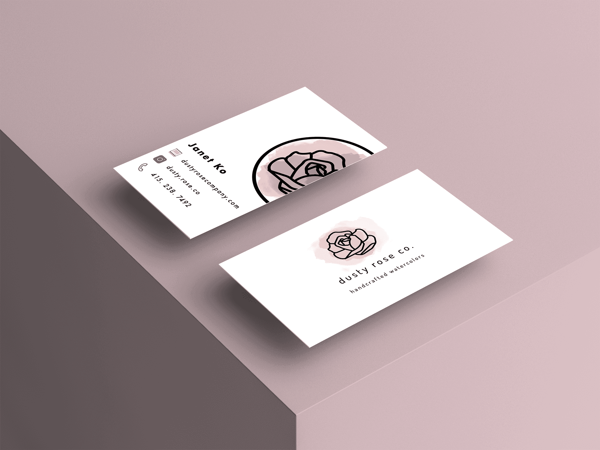
Business Card
Business cards are printed on thick 26 inch silk matte paper card stock to further bring in the feeling of luxury + colors to bring in playfulness.
©Janet Ko 2024
